
The arrival of watchOS 10 marked the first major update to the Apple Watch user interface in a long, long time. Introducing a Smart Stack of widgets is a genuinely useful feature that can give you easy access to apps and data from your Apple Watch, even from a watch face without any complications, such as the new Snoopy watch face.
But with great upgrades comes great annoyances, as introducing widgets to the Apple Watch has meant rejigging how you access some frequently used features, such as the Control Centre. Learning new gestures isn't the only issue with the new version of watchOS. Here are nine ways that watchOS 10 actually makes the Apple Watch a bit worse.
1. Control Centre has moved

Muscle memory is wonderful, allowing you to access your favourite apps or information on your Apple Watch without even thinking about it. That is, until Apple goes and changes the UI.
The new, and admittedly very useful, Smart Stack of widgets is accessed by swiping up from your watch face, which is where Control Centre used to be. I constantly try to open Control Centre with the old gesture, only to open the widgets instead.
Control Centre is now accessed by pressing the side button. But wait, didn't that used to be the app switcher? Yes, it did, so there's yet another new gesture to learn; the app switcher now requires a double press of the digital crown. I'm sure one day this will all become second nature, but right now, it's a pain.
2. You can't swipe to change Watch faces
I love a good complication. So much so that I don't have enough space for them all on one watch face. In watchOS 9, this wasn't a huge issue, as I could swipe across to another watch face with many other complications.
Except now, I can't. Swiping between watch faces is gone; you now have to tap and hold a face for a second before swiping to another one. It's a second of my life that I'll never get back, every single time.
Admittedly, the Smart Stack has reduced the need to switch faces so much, but there doesn't seem to be a reason not to at least leave swiping between faces as an option.
3. A lack of widgets
The Smart Stack is great, but there isn't a huge choice of widgets so far. Undoubtedly more third-party apps will develop widgets, but there are some key native apps missing, too. There's no Mail widget and no Messages widget, for example, even though there are complications for these apps. It means that if you want quick access to these apps, you will have to use up precious complication space.
4. The End Workout button has moved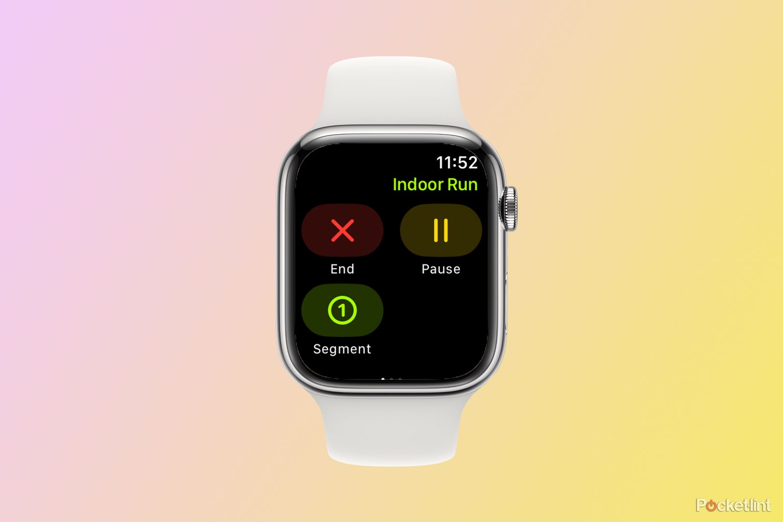
Another muscle memory gripe that's going to take some getting used to. In the Workout app, when you've just smashed your best 10K time and you're ready to end your workout, you just swipe right and tap the button in the bottom left corner, right? Well, not now.
The End button has now moved to the top left corner, with the bottom left being a new Segment button. Once again, my fingers will have to relearn something that was second nature.
5. Battery life is worse
Many users have reported significantly reduced battery life when using watchOS 10. This may get fixed in an update at some point, but getting worse battery life out of the same watch is frustrating because it's running a new OS.
6. Stopwatch is white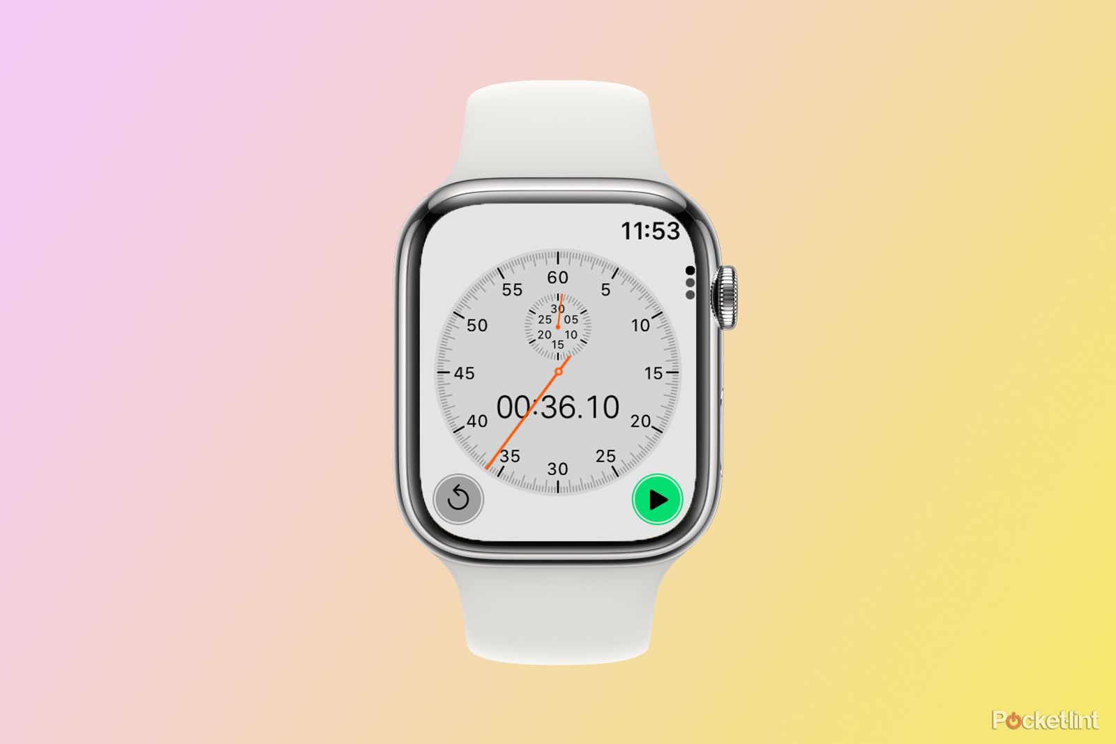
The Stopwatch app is just all kinds of wrong now. What was previously a subtle stopwatch on a black background is now a blinding white. It does stand out when the rest of your Apple Watch apps continue using the much less in-your-face black background. Make it stop, watch.
7. The stopwatch notification icon won't disappear
As if the Stopwatch app couldn't get any worse, it will now also hang around on your watch face as a notification icon at the top of the screen. This is absolutely fine when the stopwatch is running, and you can tap on the icon to return to the app. But for some reason, the icon hangs around after you've stopped the stopwatch and sometimes even after manually forcing the app to close. It's almost like it knows how much I hate it now.
8. Grid view has changed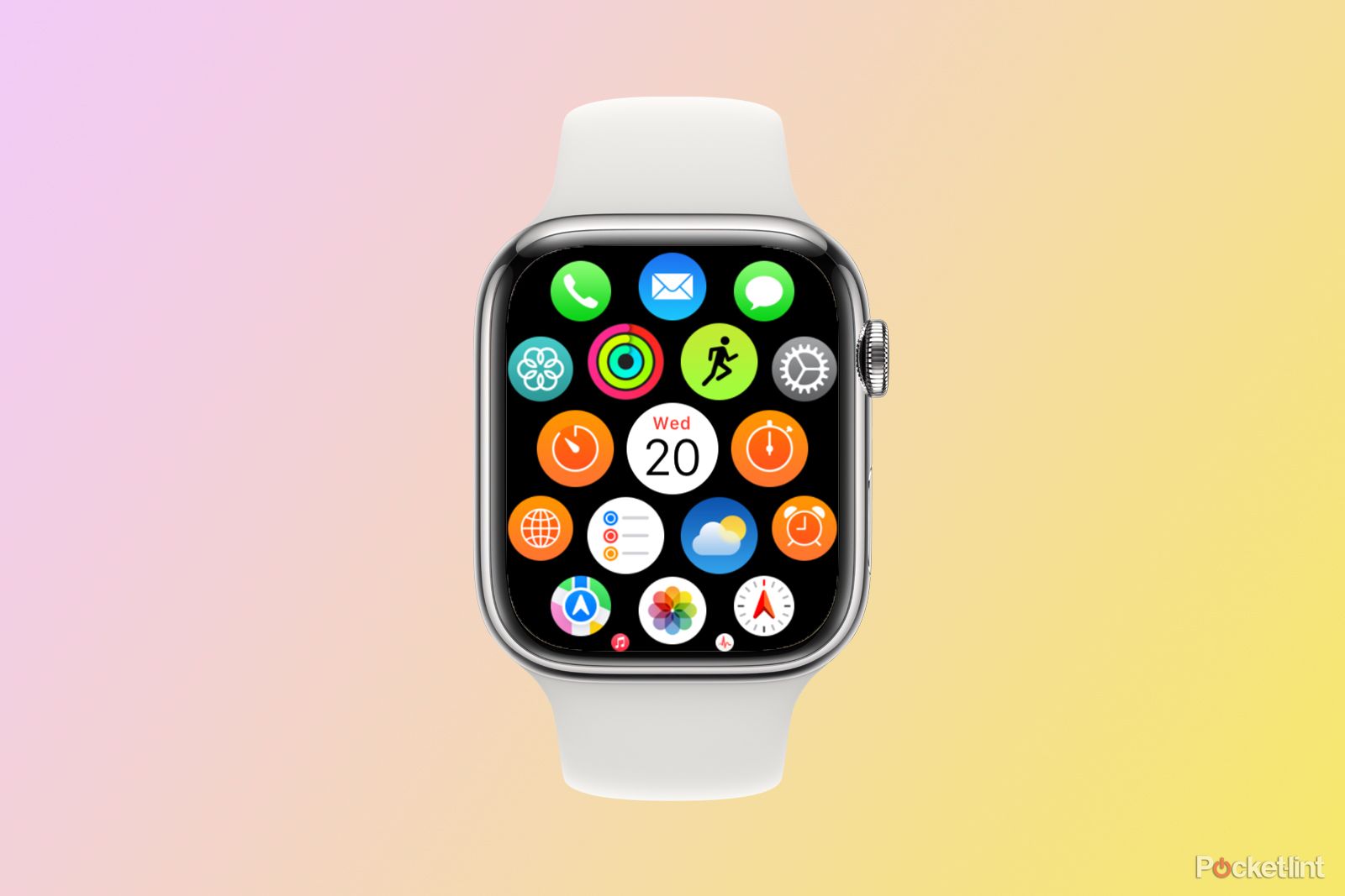
The world is divided into two types of people: those that use Grid View on their Apple Watch and those that use List View. If you are all about the Grid View, you'll be aggrieved to know that it, too, has changed. Instead of a nice hexagon of icons you could zoom in and out on with the digital crown, the Grid View is now one long collection of icons you can scroll through with the digital crown.
Once again, it's another regularly used part of the Apple Watch interface that you will have to relearn how to use. As a List View stan, I think it might be an improvement, but what do I know?
9. You can't see your Activity data on one screen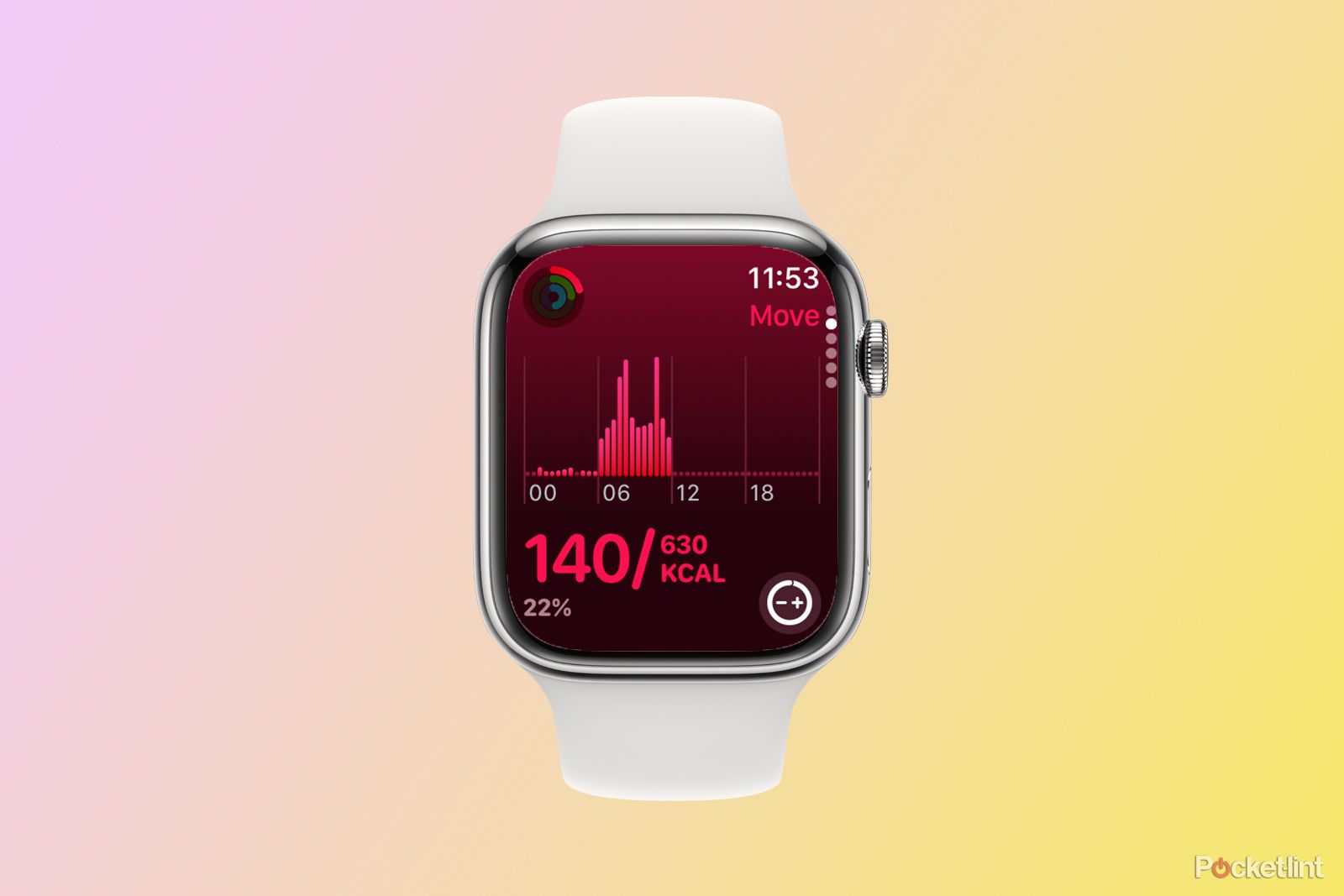
Previously, if you wanted to check your rings, opening the Activity app would bring up a graphic of the rings themselves. So far, so exactly the same. However, if you scrolled down, you used to be able to see the data for all three rings on a single screen, with your Move kcals, Exercise minutes, and Stand hours all shown in the same view.
Well, not today. Now, each ring gets its own page, so if you want to know your current scores for each ring, you must swipe through four screens to get them. You can add a widget to the Smart Stack that will show all the information at once, but it's a whole new set of gestures to learn.
Is watchOS 10 really that bad?
Many of the gripes listed above involve relearning where to find features and functions on watchOS 10. Eventually, these will become second nature and won't bother me anymore. However, some changes will always get on my nerves, such as the fact that I can no longer swipe between faces and the unnecessarily white Stopwatch app.
I'm a big fan of the new widgets, which should only become more useful as more third-party apps get their own widgets. However, there's one thing that could have made the whole update a little better, and that's the one thing that Apple doesn't really like giving out all that often: choice. The ability to choose in the settings whether or not you can swipe between faces, for example, would offer the best of both worlds, but for now, we'll have to stick with what Apple gives us.